
A great Dental Website does more than look pretty. It helps worried people feel calm, find answers fast, and book care without confusion. Patients want simple words, clear photos, honest doctors, easy forms, visible phone numbers, and proof that real people trust the practice.
The best examples below show how design can lower fear before a patient ever walks through the door. Each site has its own style, from playful pediatric pages to polished cosmetic brands, but all of them focus on comfort, clarity, and action.
Use these examples for ideas if you want a patient-first Dental Website that feels warm, useful, and easy for every family to understand.
What Makes a Patient First Dental Website Work
A strong Dental Website guides people like a kind front desk team. It explains services in plain language, shows real faces, and makes booking feel simple. It also answers common questions about payment, first visits, emergencies, and comfort options before the patient calls.
When the layout is clean, the visitor does not have to hunt. When the copy feels human, the visitor feels safer. These websites stand out because they connect design choices to patient needs instead of only showing off the practice. The purpose is not simply to decorate, but to create a feeling of confidence.
List of 19 Best Dental Website Examples
These examples show how dental practices can build trust, explain services simply, and make it easy for visitors to take the next step.
1. ARTSCI Dental
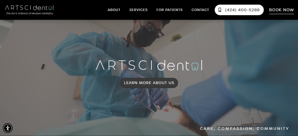
ARTSCI Dental uses a calm, modern style with direct booking, paperless forms, flexible payment options, and a strong promise of care, compassion, and community. Its homepage speaks to people who may have avoided dental care for years and tells them they will receive dignity and respect. That message makes the Dental Website feel welcoming, practical, and emotionally safe for new patients.
2. Tuttle Family Dentistry
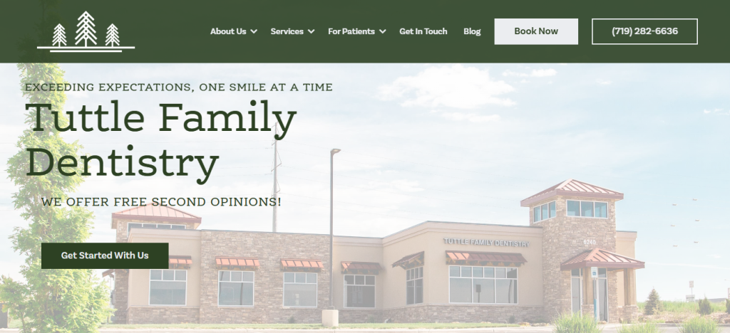
Tuttle Family Dentistry builds trust quickly with phone access, online booking, a low-cost new patient offer, and clear sections for family, emergency, cosmetic, restorative, and specialty care. The copy highlights comfort, modern technology, and a family promise. The site also shows office amenities and doctor profiles, helping visitors picture the visit before they schedule. That reduces nerves and supports confident action.
3. Woburn Dental Associates
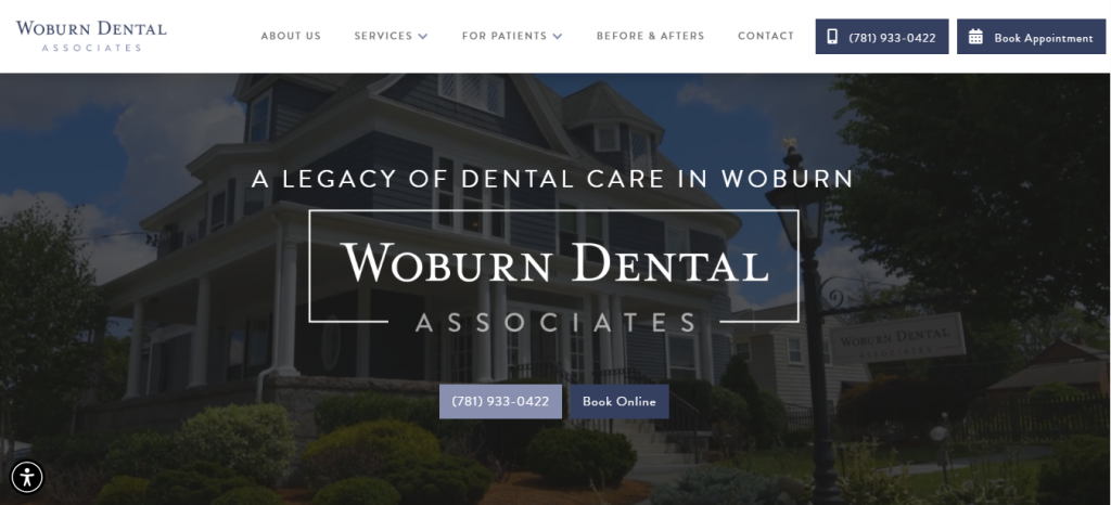
Woburn Dental Associates leans on legacy, family care, and clear patient communication. The site highlights three generations of care, virtual consult steps, before and after resources, online booking, reviews, and service cards for implants, same-day crowns, and dentures. It turns a long-established practice into a friendly digital experience that helps nervous visitors feel informed, respected, and in control.
4. Prairie Family Dental
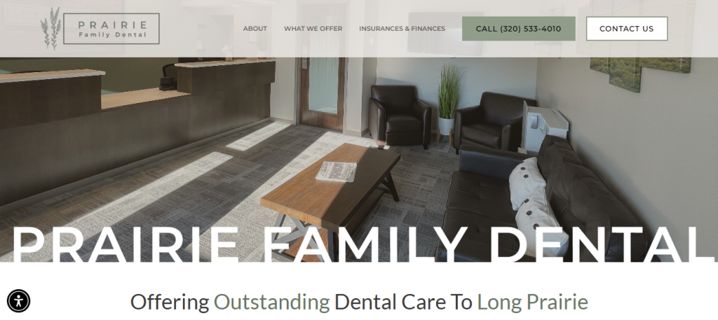
Prairie Family Dental feels personal from the first screen. It tells visitors the office is accepting new patients, explains the customized care approach, and makes affordability visible with a new patient special. The page also names practical benefits like insurance acceptance, amenities, comfort, specials, and membership plans. This Dental Website succeeds because it treats time, money, and comfort as real patient concerns.
5. Goldstein, Garber, and Salama
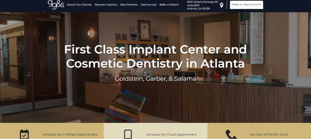
Goldstein, Garber, and Salama present a polished experience for patients seeking advanced implant and cosmetic care. The homepage gives quick appointment options, including virtual appointments, then supports confidence with featured services, a smile gallery, an in-house dental laboratory, and a long practice history. It feels premium without hiding practical information, which helps patients understand both the results and the process.
6. Skylyn Dental Associates
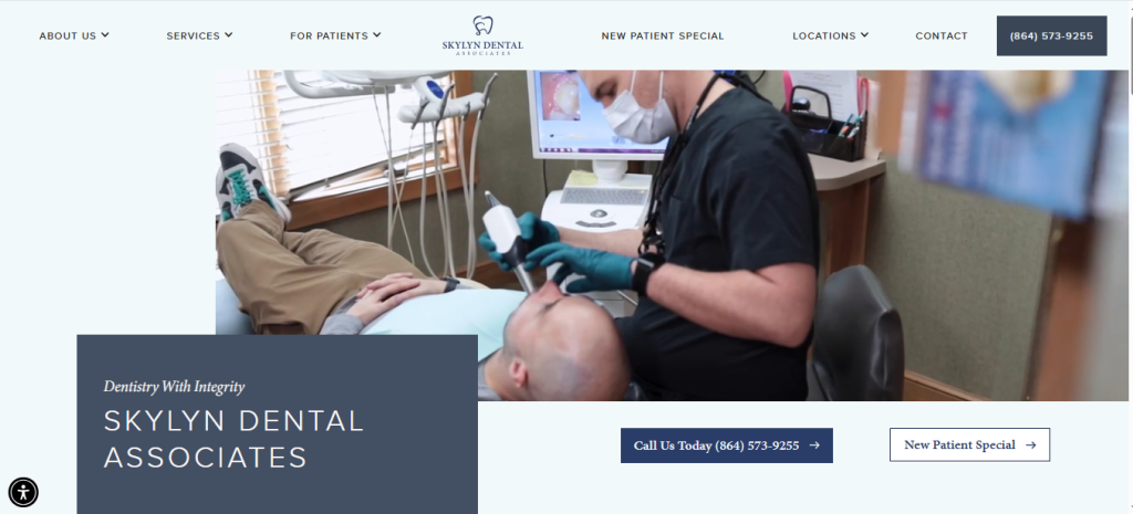
Skylyn Dental Associates uses warm language, patient family messaging, and clear featured services to make care feel approachable. It highlights Invisalign, IV sedation, emergency dentistry, implants, multiple locations, financing, a membership plan, testimonials, natural light, and TVs in treatment rooms. These details matter because they show patients what the visit may feel like, not just what treatments are offered.
7. Alliance Family Dentistry
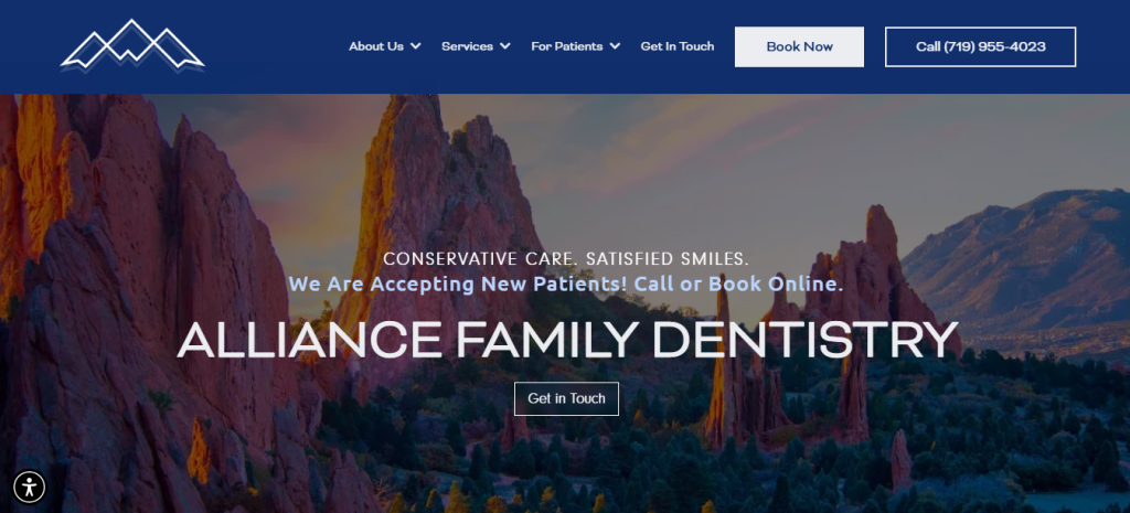
Alliance Family Dentistry puts comfort and simplicity first. The homepage states that the practice accepts new patients and offers online booking, free second opinions, financing, membership plans, and promotions. The copy promises conservative care and satisfied smiles while explaining family dentistry in everyday words. For a Dental Website, this patient-friendly mix of trust, convenience, and clarity is exactly what busy families need.
8. Milktooth Pediatric Dentistry
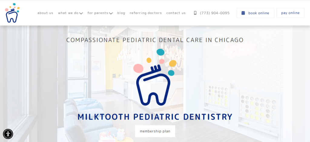
Milktooth Pediatric Dentistry turns children’s care into something bright and friendly. The site uses playful language, online booking, parent resources, pay online options, and clear services for infants, children, teens, special needs care, emergencies, and prevention. It also spotlights office design and free parking. Parents can quickly see that the practice understands kids, schedules, nerves, and daily family life.
9. New Horizon Dental Center
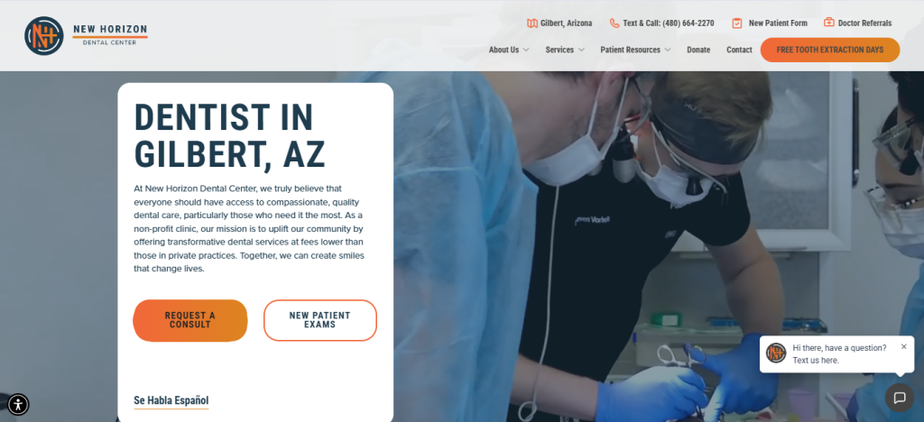
New Horizon Dental Center stands out because its mission is easy to understand. It explains that the nonprofit clinic works to make quality care more affordable, then shows reduced pricing examples, Spanish-language access, donation options, veteran support, forms, testimonials, and consult requests. This Dental Website uses transparency as its strongest design feature, helping cost-conscious patients feel seen instead of judged.
10. Great Bay Orthodontics
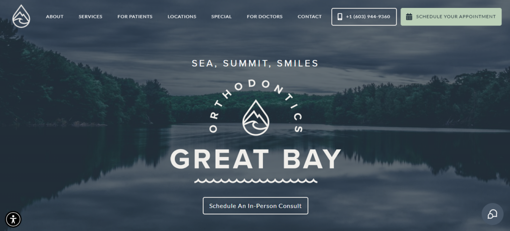
Great Bay Orthodontics brings a peaceful coastal feel to orthodontic care. The site offers appointment scheduling, free virtual consultations, Invisalign, braces, emergency support, financing, reviews, and multiple locations. Its copy describes a serene, modern environment and community-centered care. For patients or parents comparing orthodontic options, the page makes the next step feel clear, low-pressure, and easy to begin.
11. Monarch Dental Arts
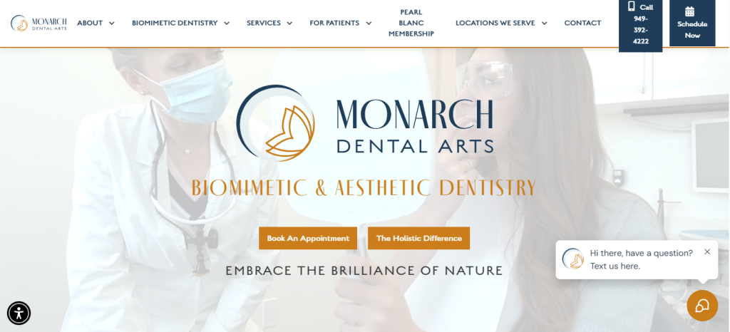
Monarch Dental Arts creates a thoughtful, wellness-focused experience around biomimetic and aesthetic dentistry. The site explains Dr. Anna’s background, the holistic difference, biocompatible materials, prevention, AI dentistry, forms, financing, membership, and careful exam timing. It is especially strong at teaching why its approach is different. That education helps patients choose care based on values, not just price or location.
12. DentAllon Dentistry
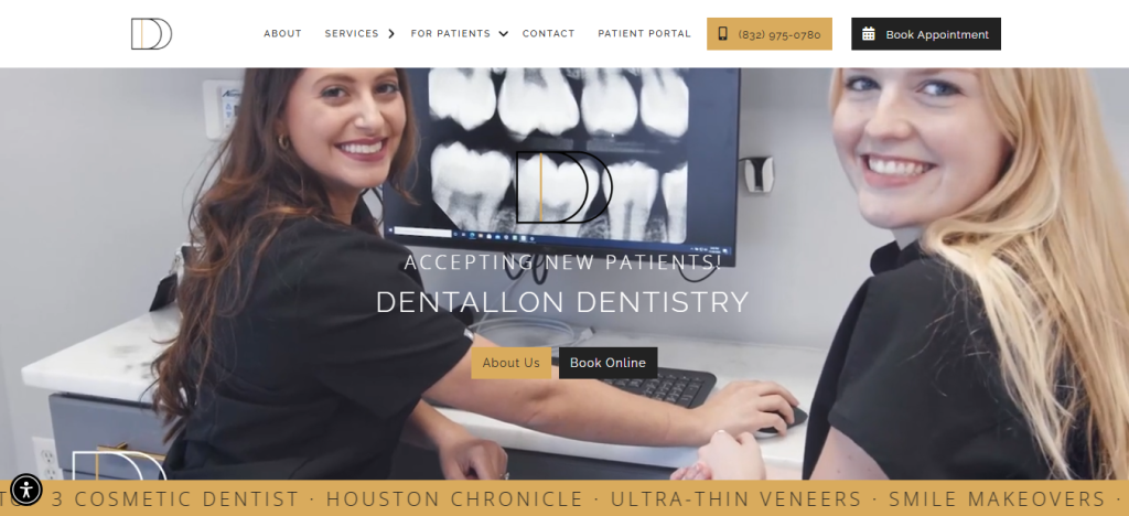
DentAllon Dentistry uses energy, personality, and strong cosmetic proof. The homepage promotes online booking, a patient portal, membership, financing, smile transformations, veneers, Invisalign, bonding, and a new patient special. Dr. Allon’s biography feels personal and joyful, which makes the practice feel less clinical. This Dental Website works because it blends beauty, technology, convenience, and a memorable doctor story.
13. Ironwood Dental
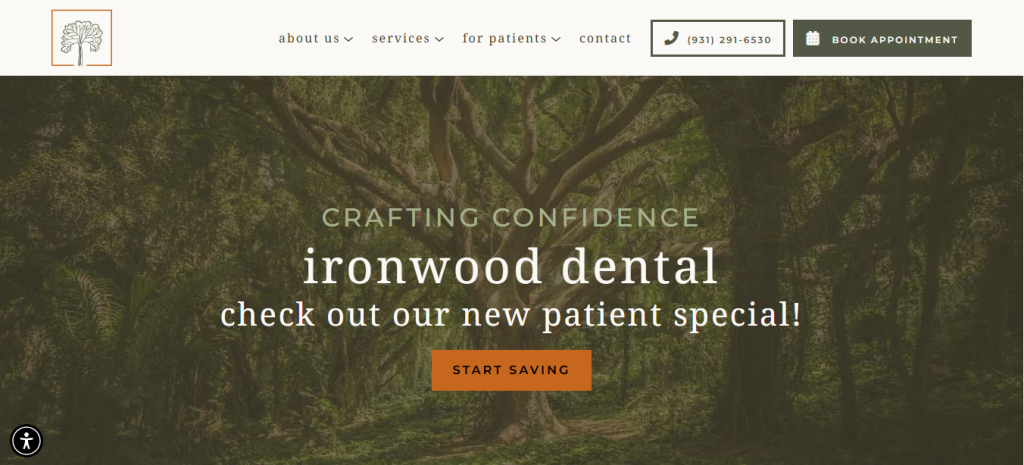
Ironwood Dental feels grounded, local, and sincere. It highlights new patient specials, online booking, a membership plan, first-visit information, implants, crowns, root canal therapy, and emergency care. The copy describes warm, modern care and real patient relationships in Clarksville. The doctor section adds hometown credibility and comfort. The result is a site that feels polished but still neighborly.
14. 1385 Dental Studio
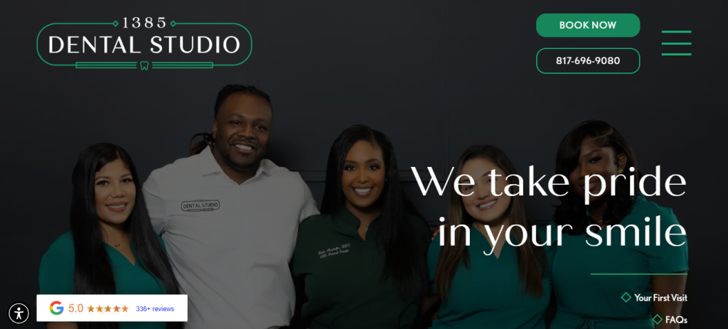
1385 Dental Studio opens with pride, safety, and a judgment-free tone. It offers book-now buttons, first-visit information, FAQs, financing, membership, pediatric dentistry, emergencies, Invisalign, veneers, implants, and preventive care. The site also introduces Dr. Mustafa through a warm personal story about service and healthcare access. Patients can quickly understand the practice’s heart, services, and easy next steps.
15. Pediatric Eyes and Smiles
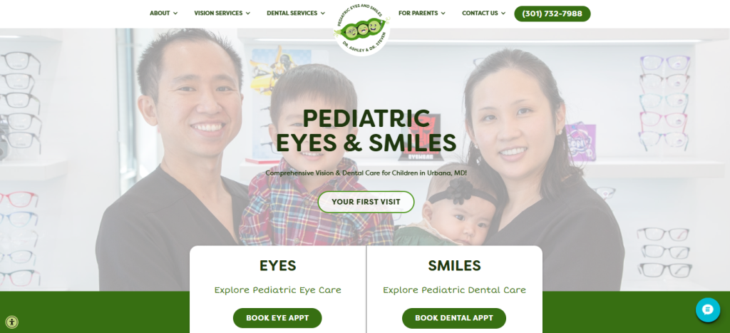
Pediatric Eyes and Smiles is memorable because it combines pediatric dentistry and eye care under one cheerful brand. Parents can choose eye or dental appointments, review first-visit details, explore insurance, read reviews, and learn about minimally invasive pediatric dental services. The design speaks to families, not just individual patients. It makes healthcare for children feel coordinated, friendly, and less stressful.
16. Bow Tie Dentist
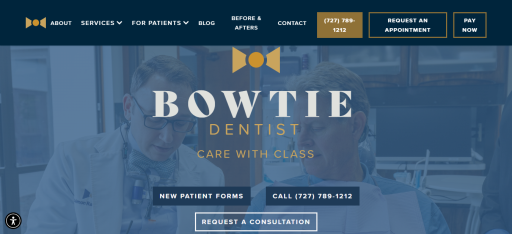
Bow Tie Dentist uses a clear brand idea and turns it into a premium patient experience. The homepage shows appointment requests, patient forms, pay-now access, before and after, and service highlights for implants, veneers, oral surgery, crowns, and full-mouth rehabilitation. Dr. Ramos’s story adds personality. This Dental Website proves that a unique brand can still feel helpful and easy.
17. The Ivory Dental Co
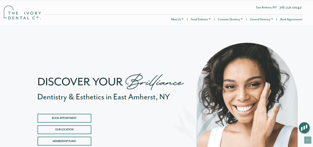
The Ivory Dental Co blends dentistry with facial esthetics in a stylish but patient-friendly way. The site offers booking, membership plans, location details, cosmetic dentistry, general dentistry, sedation, implants, Invisalign, whitening, dermal fillers, and a treatment quiz. It explains why a dentist can guide facial esthetics with knowledge of anatomy. That clear education supports trust in premium services.
18. Austin Dental Company
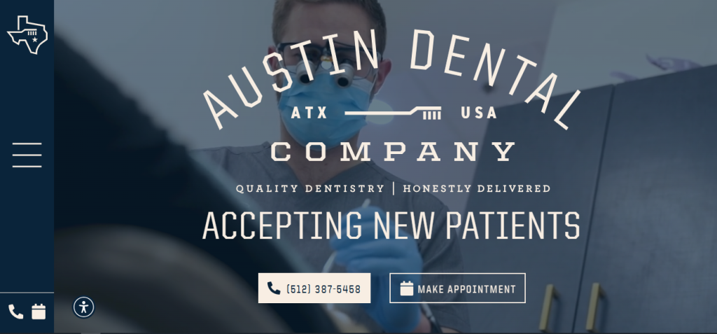
Austin Dental Company leads with honesty, virtual consults, and a relaxed tone. The site shows a three-step photo-based consult, appointment access, membership savings, financing, preventive care, restorative care, cosmetic treatments, sedation, and emergency services. Its copy says patients will not be sold care they do not need. That message makes the Dental Website feel ethical, modern, and welcoming.
19. Consultants in Dental Aesthetics
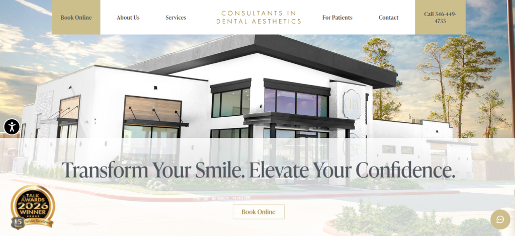
Consultants in Dental Aesthetics create a luxury experience while still guiding patients clearly. The site offers online booking, new patient resources, payment tools, smile gallery, same-day crowns, implants, sedation, veneers, digital impressions, smile simulations, and full-mouth reconstruction. It also emphasizes trust, comfort, confidence, advanced training, and five-star service. Patients see both clinical skill and emotional care.
What You Should Learn from These Dental Website Examples
Patients do not only visit a site to admire design. They visit because they need help. A great Dental Website answers their fears quickly. Can I afford this? Will it hurt? Can I book today? Is this doctor kind? Do they treat kids? Can they help in an emergency?
The best sites above use strong photos, simple menus, doctor stories, reviews, financing links, and online scheduling to answer those questions before the phone rings. That is why patient-first design often leads to more trust and better appointments.
Another lesson is that tone matters as much as layout. A cold site can make a gentle office feel scary. A warm site can make treatment feel manageable. The best pages use short sentences, clear buttons, friendly faces, and reassuring details.
They do not force visitors to decode dental terms. They guide people step by step. That kind of clarity helps children, parents, seniors, and anxious adults all feel more ready to choose care.
How To Use These Ideas for Your Own Practice?
Start with the patient’s first worry, not the practice’s favorite feature. Put the phone number, booking button, address, and key offer near the top. Show real team photos. Explain services with simple words. Add first-visit steps, payment options, reviews, and comfort details.
Keep pages fast, clean, and easy to scan. A Dental Website should feel like a helpful guide that walks patients from worry to relief, one clear step at a time. Remember, patients often decide how they feel about a practice in seconds. Clear design gives them confidence.
Warm words give them comfort. Easy booking gives them a reason to act. When all three work together, your site becomes more than a brochure. It becomes the first caring moment of the patient experience.
Next, make sure every page has one clear action. Ask visitors to book, call, request a consult, complete forms, or learn about a service. Do not make them guess. Use honest copy and avoid big promises that sound fake.
Show what makes the office different in a way that patients can feel. Maybe it is extra time, child-friendly care, advanced cosmetic planning, affordability, sedation, or same-day help. Clear differences make the practice easier to remember.
Conclusion
These website examples prove that the best dental sites are built around people, not just procedures. Some feel playful, some feel luxurious, and some feel deeply community-focused, but each one helps patients understand care with less stress.
If your practice wants more calls, better bookings, and stronger trust, study how these sites combine clear design with warm language. A patient-first website can turn a simple visit into the start of a lasting relationship.
Frequently Asked Questions
A dental website should include clear service pages, doctor information, office location, phone number, online booking, patient forms, insurance details, payment options, reviews, before-and-after photos, emergency care information, and answers to common patient questions. It should make visitors feel comfortable and help them take the next step easily.
Start by choosing a clean design, writing simple content, adding your services, and making booking easy. Include real photos of the dentist, team, and office. Add trust signals like reviews, credentials, and patient testimonials. Then make sure the site works well on phones, loads fast, and is optimized for local search.
A good dental website design is simple, welcoming, and easy to use. Visitors should quickly find the phone number, appointment button, services, location, and dentist details. The design should use calming colors, clear headings, friendly photos, and short text so patients can understand everything without feeling overwhelmed.
A website is important because many patients search online before choosing a dentist. It helps your clinic build trust, explain services, show reviews, and make appointment booking easier. A strong website also helps your practice appear in local search results, which can bring in more new patients.
A dental website can attract more patients by using local SEO, clear service pages, helpful blog content, strong reviews, online booking, and a mobile-friendly design. It should answer patient concerns about cost, comfort, treatments, and emergencies. When people find helpful information quickly, they are more likely to contact the clinic.
Patients usually look for easy appointment booking, phone number, location, office hours, accepted insurance, payment options, dentist profiles, reviews, services, emergency care, and patient forms. They also want the website to feel trustworthy, simple, and easy to use on a phone.
Improve user experience by keeping the layout clean, using simple language, adding clear buttons, speeding up the site, and making it mobile-friendly. Place booking and calling options where patients can easily see them. Use short sections, helpful images, FAQs, and clear menus so visitors do not get confused.
The best layout for a dental website starts with a strong homepage banner, clear appointment button, phone number, and location. Then it should show main services, dentist introduction, patient reviews, payment or insurance information, and contact details. Each page should guide visitors toward booking an appointment.
A dental website can increase bookings by adding visible “Book Appointment” buttons, online scheduling, click-to-call phone numbers, simple contact forms, and trust-building content. Reviews, before-and-after photos, new patient offers, and clear service pages can also help patients feel ready to schedule.
Some strong dental website examples include ARTSCI Dental, Tuttle Family Dentistry, Woburn Dental Associates, Prairie Family Dental, Milktooth Pediatric Dentistry, Great Bay Orthodontics, Monarch Dental Arts, The Ivory Dental Co, Austin Dental Company, and Consultants in Dental Aesthetics. These sites are useful because they focus on clear design, patient comfort, trust, and easy booking.
Design That Turns Visitors Into Patients
If you want a modern Healthcare Website Design that actually helps your practice grow, it’s time to move beyond just a “good-looking” website. Patients today expect clarity, trust, and instant access to care and your website should deliver exactly that.
A strong healthcare website guides visitors clearly from understanding your services to booking an appointment without confusion. When the design is simple, fast, and patient-focused, it naturally turns traffic into real patients.
Upgrade your website to create a patient-friendly experience that builds trust and increases bookings.